I hate those wedding competition shows on TV. They’re exhibitionist, and shallow, and a lame excuse to judge other people. No, wait–those are my favorite things. I LOVE those wedding competition shows on TV.
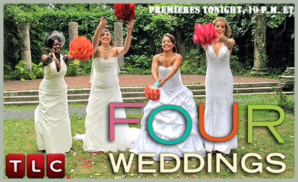
In Four Weddings, my favorite of these terrible shows, brides attend eachother’s weddings and judge the shit out of them. “The chicken was ok, the steak was over/undercooked, but the potatoes were great.” “What are we supposed to do in the 4 hours between the wedding and reception?” “This DJ sucks, I wanna dance my cake off!”
Most of us who have planned or are planning a wedding probably wouldn’t like to admit it, but a lot of the choices that are made are really for the guests–to please, accommodate, entertain, surprise, or impress. Yes, of course the wedding should be about the couple, should be their idea of the perfect event. But let’s face it–in most cases, there wouldn’t be a wedding if there were no guests. I certainly wouldn’t buy such an expensive dress and have a stranger read to me for like 15-60 minutes and have cocktails followed by a big dinner if it were just the fiancé and I. Well…I wouldn’t buy quite such an expensive dress. Dinner and cocktails would probably still occur.
I think it’s safe to say that a lot of the traditions, the pomp (and circumstance), and other things happen because family and friends expect those things to happen. There’s a formula that works, that everyone understands as “wedding.” If you tell people that this is what they’re attending, they know they will sit down somewhere, gasp when they see the hostess in a fancy dress, sit through some boring or touching readings, maybe drink a bit, have a meal, and then shake their money makers. Maybe do the chicken dance. Maybe bounce the bride and groom around on chairs. Of course you can deviate, but only so much that it’s still recognizably a wedding. If you ask people to come to, say, the speedway, watch the hostess and host chase eachother around the track while wearing a monkey and a banana costume (respectively), then give each guest a coupon for a corn dog and limeade from Sonic for their drive home, they would be hard-pressed to call that a wedding. Potentially a pretty great afternoon, but not a wedding.
This idea of making choices based on how they will affect your guests got me thinking that wedding planning might really be about user experience design. Not that I really know what that means (you could learn more about it here: What is User Experience Design?). But from my limited understanding, it focuses on the concept that experiences (most often applied to websites and interfaces) should be built with the user at the center. Rather than taking your information and designing a website to fit, you should think how the user will search for, find, and use your information–then design a site that will let them do so as efficiently as possible. Do not confuse your user. Do not frustrate them. Do not piss your user off. Give them a happy experience and they will buy what you’re selling (or read what you’re writing, etc).
This metaphor seemed to work pretty well the more I thought about it. At my wedding, I have to make sure my guests’ basic needs are addressed, like making sure there are food options for our prominent vegetarians and that there are enough places for everyone to sit, similar to ensuring your website has the basic functionality expected of a website (a header, some navigation, a search box, etc).
Labeling is extremely important to websites, and probably in weddings as well. Where are the ceremony, cocktail and reception areas? Where are the bathrooms? Are there nuts in this dessert? Where should I sit? If your user doesn’t understand what the different parts of your interface do and how to accomplish what they came to do, they’ll get confused and probably leave.
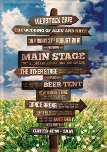
Maybe too many labels.
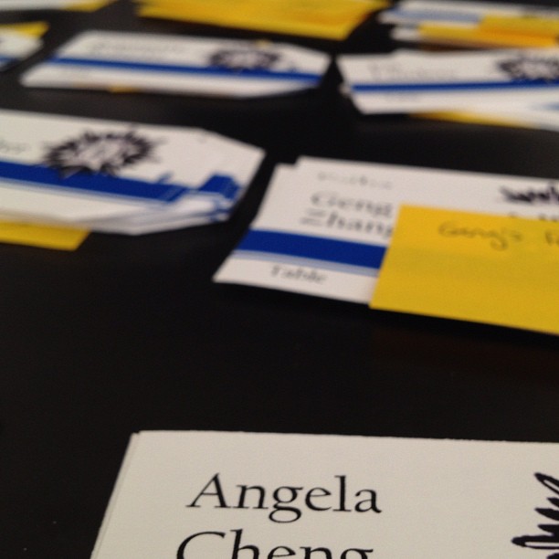
We really did a card sorting exercise to figure out the seating chart. That’s related more to information architecture than UX but sue me.
There is the concept of flow, which in UX design might mean thinking about how users enter your site (from a browser to the home page? From a tweet to a permalink-ed post?) and how they will move to the information they’re looking for. When choosing a wedding and reception venue you have to think about similar questions: How will guests know when cocktail hour is over and where to go next? Is there a clear traffic pattern for the buffet, and room for people to get in and out?
Yes, I’ve thought about all of these questions (and many, many, so many more). I hope I’ve answered them all in a way that will make it easy for my guests to enjoy the wedding without worry–they say the best UX design is invisible as users don’t have to work their way out of problems caused by bad UX. But more than making sure we don’t lose grandma on her way to dessert, I’m hoping my decisions will have given our guests a certain experience and overall feeling–happiness, joy, warmth and fuzziness, reflection, a little sentimentality.
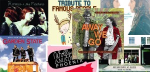
My reception location and decor will hopefully make guests think they’re in a lovely English country manor à la Downton Abbey. My playlist for cocktail hour was mixed in the hope that guests will feel like they’re in a great indie movie like Garden State or Away We Go. And I’m trying to decide whether I want our first dance to make people grin or if I want to make them cry like babies…
P.S. LESS THAN TWO WEEKS. Homygod.


Leave a Comment